Overview
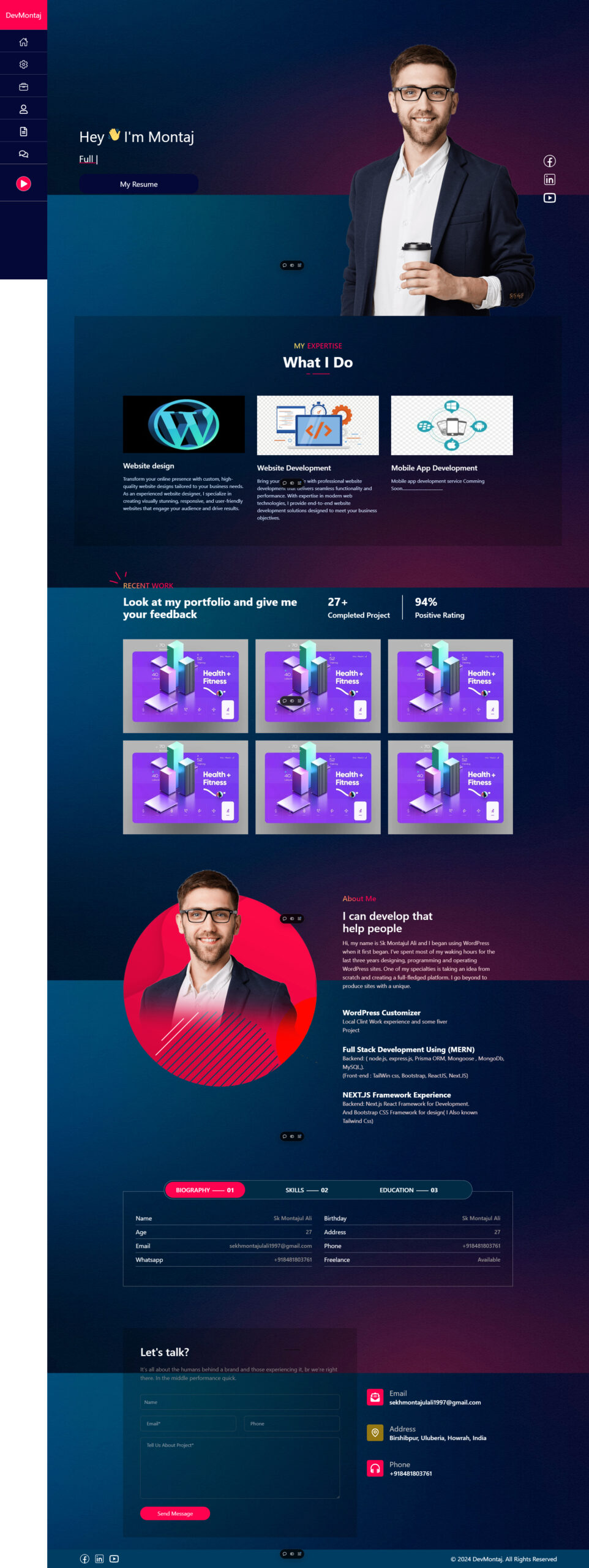
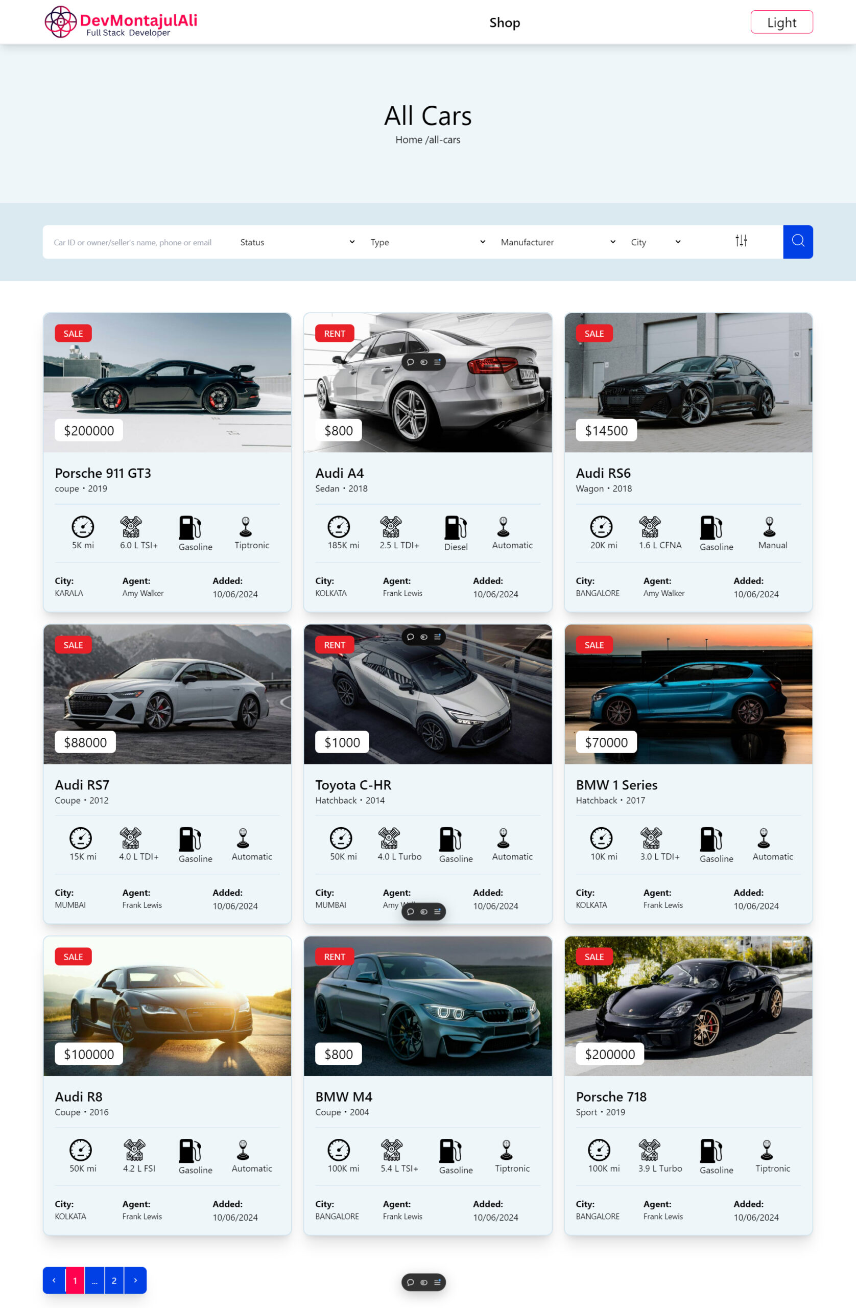
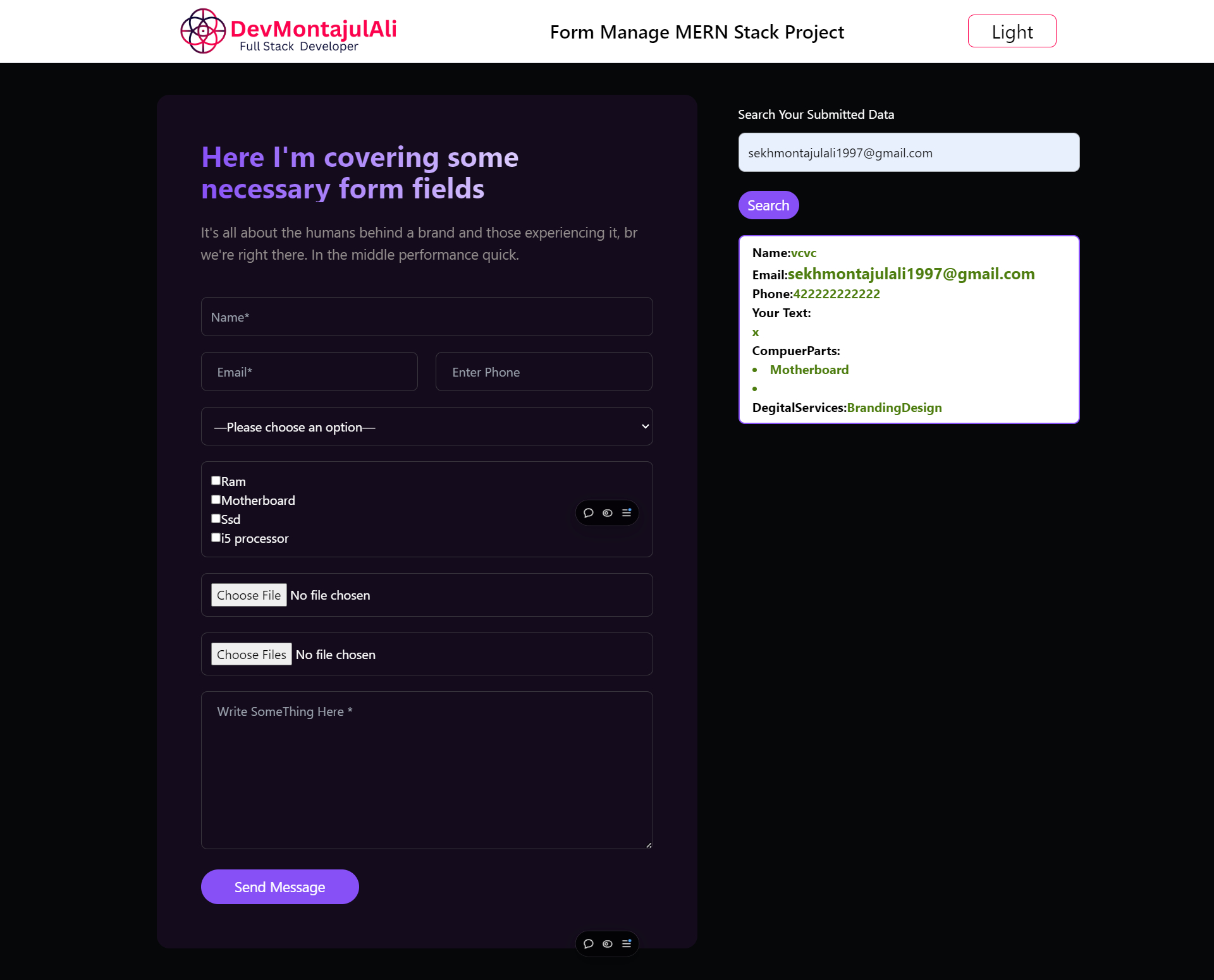
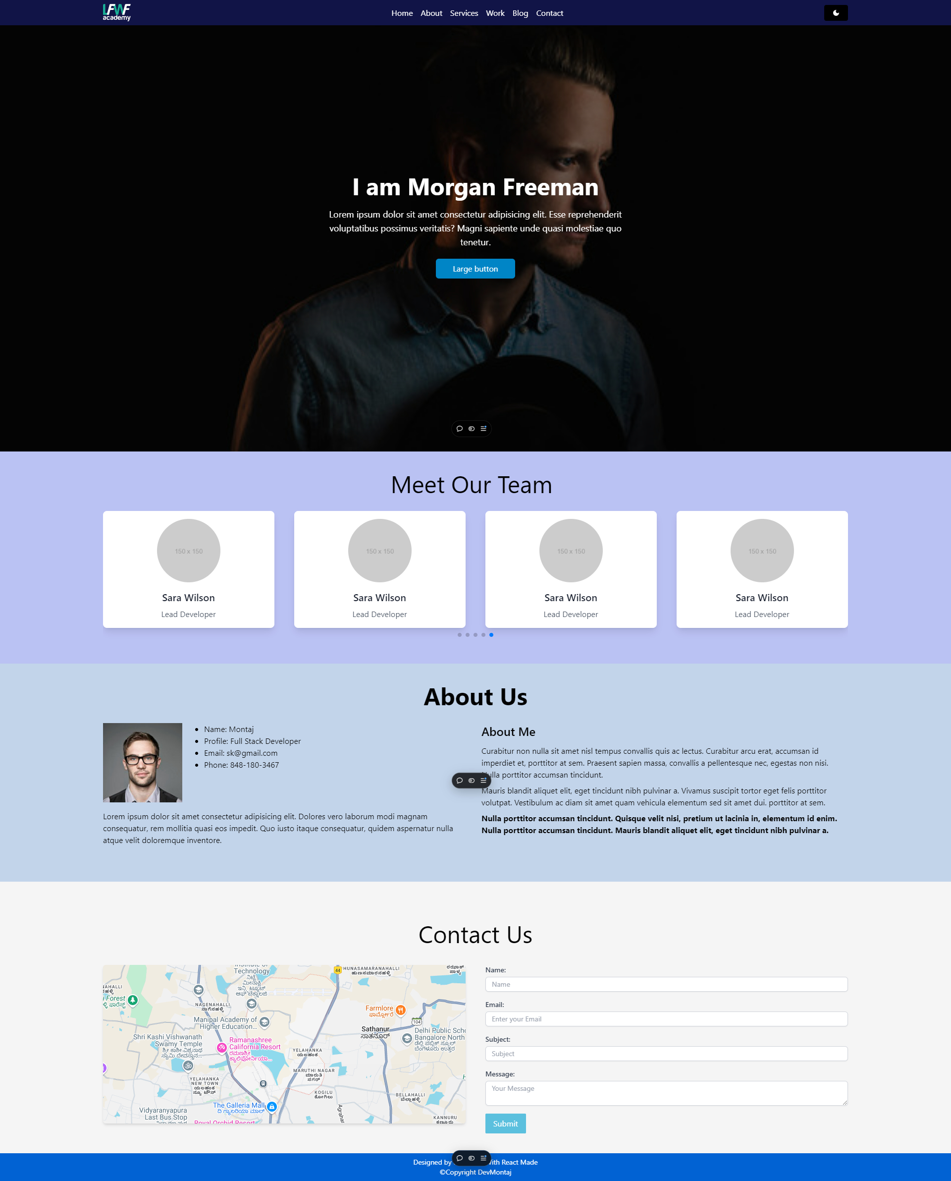
In this project, I developed a personal portfolio website using React for the front-end framework, React Router for seamless navigation, and Tailwind CSS for styling and layout. The goal was to create a visually appealing, responsive, and fast-loading static site that showcases my skills and projects.
Challenges
- Dynamic Navigation: I wanted to create a portfolio where the navigation between pages was smooth without reloading the whole page. This was essential for maintaining a fluid user experience and making the website feel like a single-page application (SPA).
- Scalability: I needed a design system that would allow me to easily add new projects, skills, or sections to the website without extensive restructuring or code duplication.
- Responsive Design: The website needed to be fully responsive across all screen sizes, ensuring optimal performance and usability on mobile, tablet, and desktop devices.
- Efficient CSS Management: I wanted to avoid bloated CSS and ensure that my website loads quickly, despite having several custom-designed sections, including hero banners, project showcases, and skill overviews.
Technologies Used
- React: As the core of the project, React allowed me to break the website down into reusable components. This modularity made it easy to manage different sections of the website, such as the header, footer, and various content sections.
- React Router: React Router was instrumental in creating the navigation structure. I implemented multiple routes for pages like the home, projects, skills, and contact sections. With its easy-to-use API, I ensured that the user could navigate between sections without any reloads, enhancing the overall user experience.
- Tailwind CSS: I used Tailwind CSS to style the website and create a custom design system. Tailwind’s utility-first approach allowed me to quickly prototype and style each component directly in the JSX, which improved productivity and reduced the need for external CSS files. Tailwind’s responsive grid system made it easy to ensure that the layout adapted to different screen sizes effortlessly.
Key Features
- Single Page Application with React Router:
- I implemented React Router to create routes for the different sections of my portfolio. This included routes for:
- Home
- About Me
- Projects
- Skills
- Contact
- Users can navigate between these sections without a page reload, giving the feel of a fluid single-page application.
- I implemented React Router to create routes for the different sections of my portfolio. This included routes for:
- Component-based Design:
- Each section of the portfolio (e.g., hero banner, project cards, contact form) was built as a React component. This modular approach made it easy to maintain and update the content as needed. For example, I can easily add new projects by simply passing new data to the project card component.
- Responsive Design:
- The entire layout was designed to be fully responsive using Tailwind CSS. I used Tailwind’s built-in responsive utilities to ensure that the website looked great on devices of all sizes, from mobile phones to large desktops.
- I designed a mobile-first layout, where smaller screens display the content vertically, and as the screen size increases, I adjusted the grid system to display multiple columns.
- Minimalist and Clean UI:
- I aimed for a clean and minimalist design to ensure that the content was the main focus. Using Tailwind CSS’s typography and spacing utilities, I maintained consistent spacing and balanced layouts throughout the site.
- Fast Loading Static Design:
- Since the portfolio is primarily a static website, I focused on optimizing performance. By using React’s built-in optimizations and Tailwind’s purge feature (which removes unused CSS), the website remained lightweight and loaded quickly even on slower connections.
Outcome
The final product was a visually appealing, fast, and responsive portfolio website that showcases my skills and projects effectively. Thanks to React and Tailwind CSS, I was able to deliver a high-quality site that can be easily updated and maintained.
Lessons Learned
- Modular design with React: React’s component-based architecture made it easy to break the website into manageable pieces, allowing for easy updates and scalability.
- Efficient styling with Tailwind CSS: Using Tailwind CSS reduced the need for writing custom CSS and ensured that the design was both consistent and responsive across different devices.
- Routing with React Router: React Router enabled seamless navigation between different sections of the website, providing a smooth user experience without unnecessary page reloads.
Next Steps
As the next steps, I plan to:
- Add more interactive features using React hooks and context API for better state management.
- Implement animations using Tailwind CSS and other React libraries to make the site even more engaging.
- Include additional sections for blogs or testimonials to enrich the content and demonstrate more of my technical expertise.
This project is a testament to my ability to work with modern front-end technologies and create performant, responsive, and visually compelling websites.

