Overview
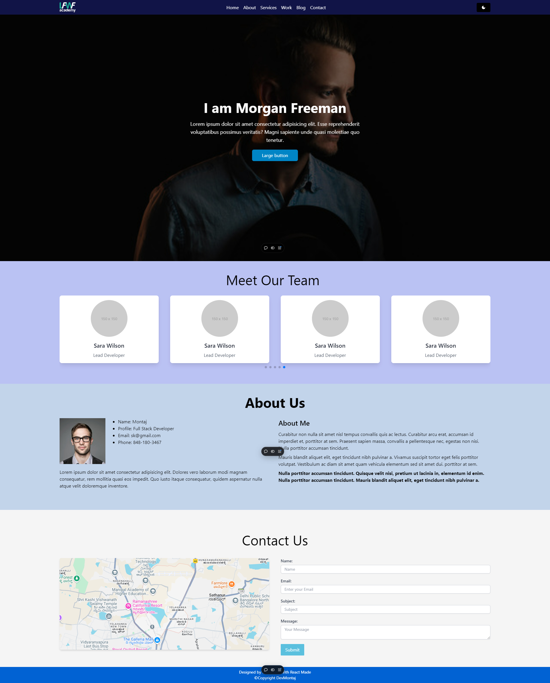
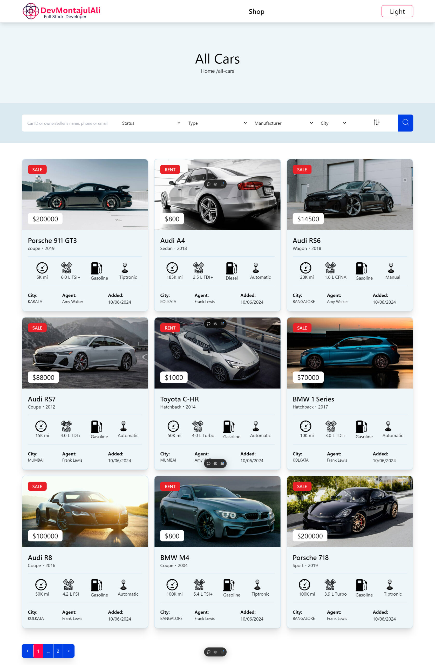
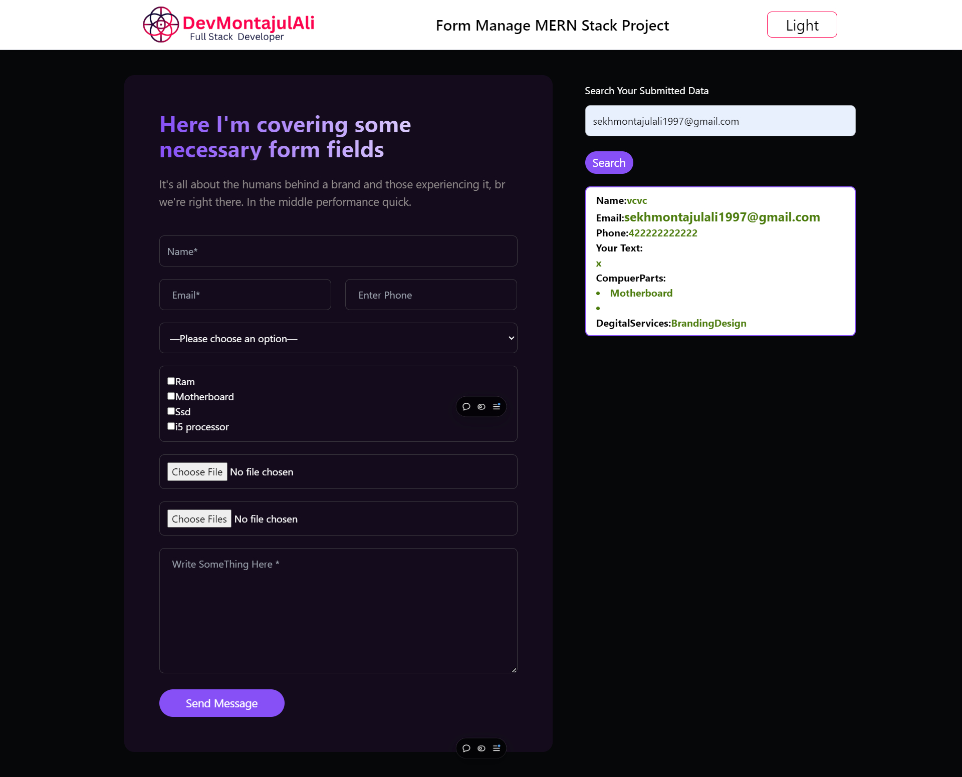
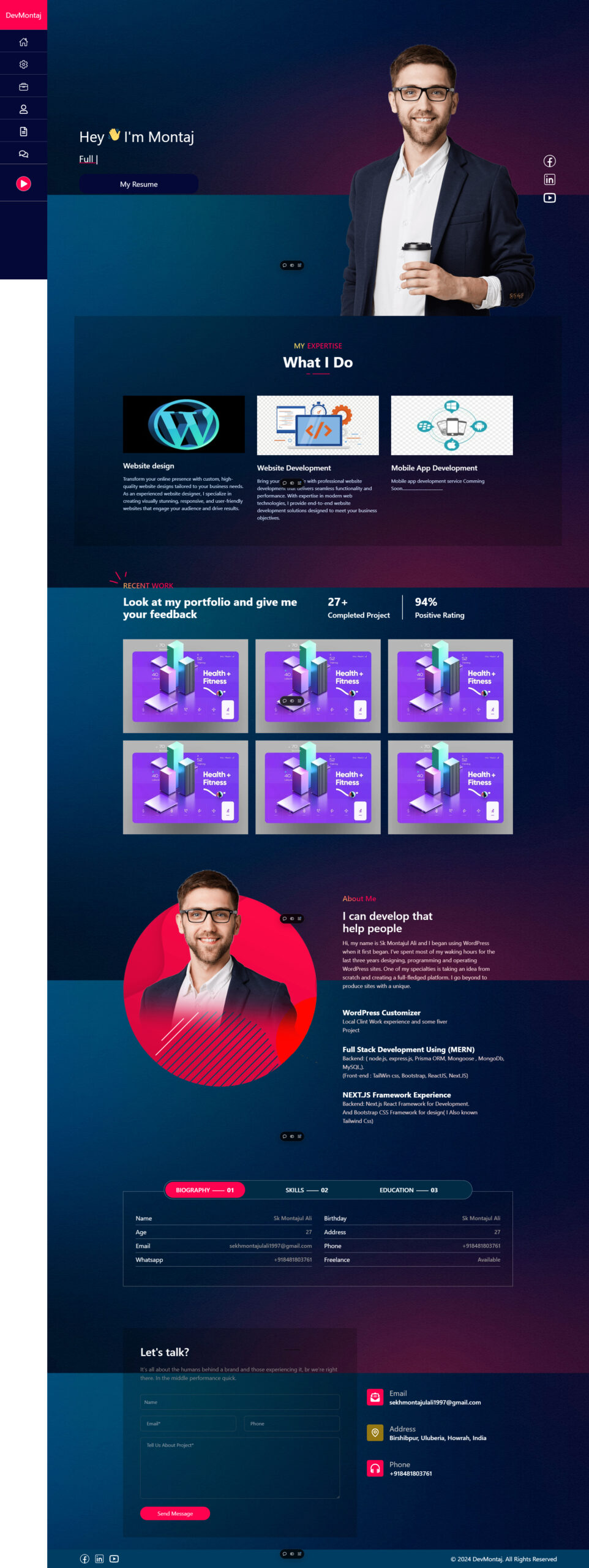
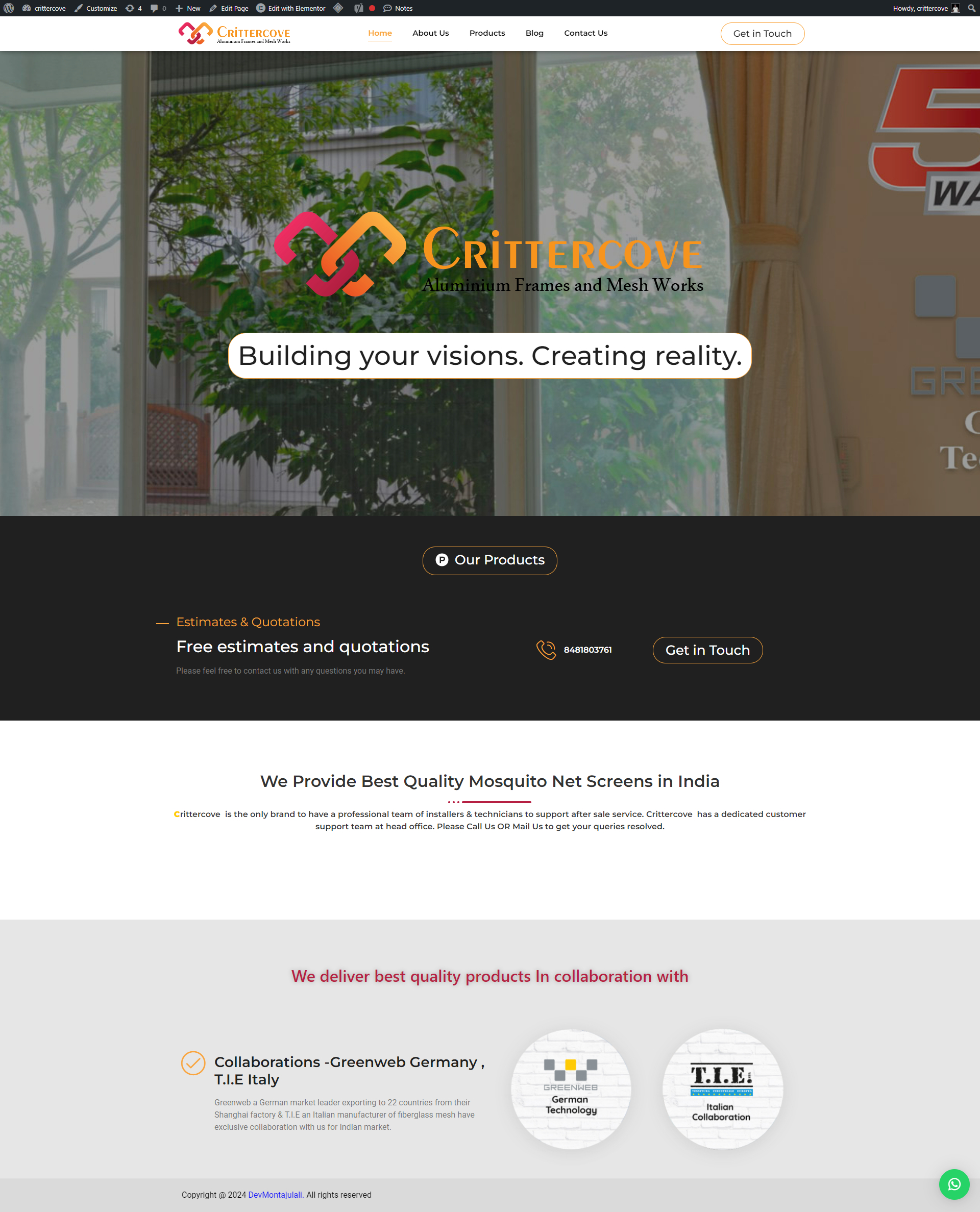
In this project, the goal was to develop a modern, responsive static website using React, Tailwind CSS, and React Router. The website was designed with an emphasis on clean UI/UX, efficient navigation, and user-friendly features, including a light/dark mode toggle. The focus was to create a lightweight, static site that delivers fast loading times and a smooth user experience across devices.
Challenges
- Static Content Delivery: The primary challenge was to build a static site that could deliver content without needing backend interaction, while still using React to manage the components and routing effectively.
- Routing without Page Reloads: Navigating between pages required a system that allowed for smooth transitions without the traditional page reloads seen in static websites.
- Responsive and Aesthetic Design: Ensuring that the design is responsive and maintains consistency across multiple devices, especially mobile devices, was crucial.
- Light/Dark Mode Feature: A key feature for modern websites is the light/dark mode toggle, which allows users to switch between color schemes depending on their preferences.
Technologies Used
- React: React was chosen for its component-based architecture and ability to manage state efficiently across different sections of the website.
- React Router: For seamless page transitions and navigation without reloads, React Router was used to handle routing between different static pages.
- Tailwind CSS: Tailwind CSS was employed for styling. Its utility-first approach made it easier to build responsive designs with customizations for both light and dark modes.
- Local Storage: To persist the light/dark mode feature across user sessions, local storage was used to save the user’s preference.
Solution Implementation
1. Static Website with React Components
Using React, the entire website was split into reusable components (e.g., header, footer, about section, contact form, etc.). Each component is responsible for a specific part of the website, making it easy to maintain and scale. Since the website is static, all the content was rendered at build time, ensuring faster load times.
2. React Router for Page Navigation
React Router was set up to manage navigation between different sections of the website (e.g., Home, About, Services, Contact). This enabled users to move between pages without full page reloads, enhancing the overall user experience. With React Router, a single-page application (SPA) structure was achieved, but the content remained static.
3. Tailwind CSS for Styling and Responsiveness
Tailwind CSS played a vital role in designing the website. Its mobile-first design approach ensured the website was fully responsive on all screen sizes, including desktop, tablet, and mobile. Tailwind’s utility classes allowed for quick customization of elements without writing extensive custom CSS.
For instance:
- Flexbox was used to create layouts with consistent spacing and alignment.
- Media queries ensured that the design adapted well to different screen sizes.
- The dark mode variant in Tailwind CSS made it easy to switch between the two themes (light and dark).
4. Light/Dark Mode Feature
The light/dark mode was implemented by toggling CSS classes based on user input. Tailwind’s built-in dark mode utilities were used to switch between the light and dark themes. The user’s choice was stored in local storage, so their preference persisted even after they left or refreshed the website.
The implementation flow was as follows:
- A button was placed in the header to allow users to toggle between light and dark modes.
- When the button was clicked, the class responsible for dark mode (
dark) was toggled on the roothtmlelement. - Local storage was used to save the user’s theme preference, ensuring it was remembered for future visits.
Key Features
- Responsive Design: The website is fully responsive, providing an optimal viewing experience across all devices. Tailwind CSS made it easy to achieve a mobile-first design.
- Seamless Navigation: React Router allowed for smooth, reload-free page transitions, giving the website an app-like experience.
- Light/Dark Mode: The light/dark mode feature improves user experience by providing theme choices. Tailwind’s dark mode utilities made the implementation straightforward, while local storage ensured persistence of the user’s choice.
- Static Content with Dynamic Feel: Even though the website is static, the use of React components and routing provides a dynamic feel, typically found in SPAs.
Results
- Improved Performance: The static nature of the website resulted in fast load times, improving both user experience and SEO rankings.
- Better User Engagement: The light/dark mode feature contributed to increased user engagement as it catered to individual preferences.
- Scalability: By using React components, the website can be easily scaled in the future if new sections or pages are needed.
- Modern Design: Tailwind CSS allowed for quick and efficient design, ensuring that the website looks modern and professional across all devices.
Conclusion
This project showcases how React, React Router, and Tailwind CSS can be leveraged to create a static website with dynamic features. The combination of a responsive design, fast navigation, and the popular light/dark mode feature resulted in a user-friendly, aesthetically pleasing, and high-performance static site. This approach is ideal for projects that don’t require complex backends but still need a modern and interactive front-end.

